Project:
Bookster (UI Design)
About bookster:
Bookster (UI Design)
About bookster:
Bookster is a platform to recommend book to users. It is perfect for curators, readers or even any user who are about to begin having interest in reading.
There are plenty of method and style Bookster served to ensure user become more passionate in reading activity and been recommended by valuable books.
There are plenty of method and style Bookster served to ensure user become more passionate in reading activity and been recommended by valuable books.
Prologue
This post is going to elaborate on Bookster's master design rationale. You will go through 4 sections which going to explain on the design accordingly. The sections are: -
I. Design overview
III.Master design breakdown
IV. Closing
Design overview
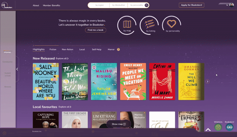
Below is an attachment of the Bookster's homepage design for your reference. I have decided to design a homepage after users have log into the web app.
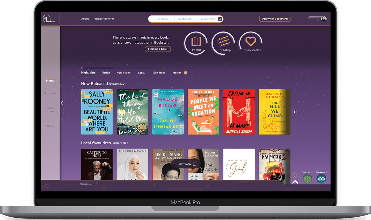
Master Page
The theme for the master design above is magic. I came up with this theme because I believe every book in this world are magical in it's own manner. This feeling may also have been encountered by most readers in the world whether they realize it or otherwise. As an example, "a really good book transports you from your surroundings, it blocks out all noise, and suspends reality; it absorbs you in the story and takes you on a journey with the characters or authors, where you see and feel everything they do" (Book Revise,2022). Somehow, it develops our emotion, imagination, education or even self relation.
By coming up with this idea, I am just trying to ignite that unexplainable feeling into something more obvious which can be applied through design. In addition, I want the users to have similar charm as reading a book with recommending a book through the Bookster's web app.
In the next section, I will explain on how I balance out the magical theme and recommending book into my design style for Bookster.
Design style
Inspiration
My first process, I collected various of magical images into one mood board to find the design style for Bookster.

Magical design inspiration
From this moodboard, I grab several magical elements to apply in my design. The elements are: -
I. Violet colour
II. Gold texture/colour
III. Gradient
IV. Sparkling particles
V. Galaxy background
VI. Sky with cloud
VII. Geometric symbol
VIII. Crystal
XI. Crystal ball
X. Owl
XI. Glowing effect
XII. Smoke effect
XIII. Transform into something else
XIV. Transition experience
XV. Floating effect
XVI. yellowish background
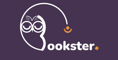
Brand logo
I decided to make an owl as mascot for bookster's logo because of it's feature. It has a concave face and glowing big eyes that sometimes appear to be wearing glasses. It represents figure who have high level of intelligence and wisdom. I feel it connects with Bookster as it is a platform for users to obtain more knowledge through recommending and reviewing books.
Moreover, in magical story it was mentioned that owl glow it eyes at night to protect mythical creature. It can also be one of the feature for the branding as it can grab quick attention to visitors even from a distance.
In the process of designing the logo, I enhanced the feature of a heart shape forehead to resembles an open book. As for its side feature, it can easily look like a letter 'B' to represent Bookster. Then, to add in magical elements to it I designed a halfway circle and carry forward it's glowing eye at the pointer. Somehow, it looks as if the owl is wearing a wizard hat.
Then I added in text of "ookster" and violet background to enhance more on the magical theme. I used Nunito because it can be easily obtained from Google Font and economically free for Bookster. In addition, the font is good for reading as the spacing and feature helps in reading either short or long text and another advantage is the letter "o" resembles the mascot's eye.
The step-by-step design process and elements were combined to give an originality to our branding. It can become a memorable feature as users can easily recognize our brand and separate us from competition.
Moreover, there are two types of logo been created. One is where the owl open its eye and another one when they close. These two will change based on the background colour of the web either when it's dark or when it's lighter.

Step-by-step of getting the logo for Bookster
Logo of the mascot close it's eyes

Logo of the mascot open it's eyes
Font
Bookster's web app will require plenty of reading lengthy text through synopsis, reviews and articles. I chose Nunito as the primary font because I was going for something simple, clean and straightforward to ease the readability experience to the users. It rounded edges also helps to give warmth feeling to the users while reading it. The uniform stroke also works well for both body and display. That was also the reason why I portrayed it into my logo design as well.
It comes with 8 font styles with different thickness, from extra light to black type. These variation helps to give hierarchy from important text to a text which require less attention.

Colours
Primary colour
Violet colour radiates magical feeling in the web app. This colour always been associated with something mystery or out of this world. Somehow, it gives originality to the design. In addition, it is also a cool shade which has been used to create soothing and restful mood. This colour has a variety of effects on the mind and body, including uplifting spirits, calming the mind and nerves. I want users to feel excited every time they log into Bookster. In addition, I have also applied this colour on background to serve as an identity of this homepage.
Orange colour was chosen to radiate gold effect in the web app. It also compliments violet because it also gives spiritual and happy vibe . When there is a lot of usage of violet colour in the web, orange soothes the overall look.
Background colour
The background colour was inspired by purple sky gradient below. Since I want to develop magical feeling into the web. Ive created gradient colour out of two tone of violet and one tone of light orange.
Semantic colour
Semantic colours states good, bad, or warning. These colours have been used to show ratings, bookmark and curator's profile link. It will be added accordingly.
Complimentary colour
There are two colours I am taking as complimentary colour which is steel blue and hunter green. These colours been used on icon that resembles magic balls which will be rationally explained later in master design breakdown.

Colour Pallete for Bookster's web
Icons
Most of the icons that Ive used are outline icons as it is easier to notice than solid one. The web looks lighter too when using outline icons. In situation where I want to make it more apparent I just added circle background behind it. Moreover, I also tried to select icons that are not round edge to give a strong look and balanced out to the web as most of the buttons and images are rounded corner.
There are only two cases of solid icons which need to be used in rating and drop down button.

Icon lists
Responsive layout
12-equal width column has been applied in this web design. The number 12 is the most easily divisible among reasonably small numbers; it’s possible to have 12, 6, 4, 3, 2 or 1 evenly spaced columns. This gives designers tremendous flexibility over a layout.
This grid is accompanied with 8 point spacing. This spacing is used in the layout because it scales perfectly in all the different screen displays. This is very practical for designing responsive screens because the numbers 4 and 8 are easily multiplied, they provide flexible and consistent steps between elements and columns.
With 8 point grid, I have used 24px gutters (the white space between columns). Proper negative space around the elements makes the website soothing to the eyes, it helps users breathe and not get overwhelmed with information.
Lastly, I have used 240px for side margins (spaces between layout). This helps greatly in guiding the users through the page and prioritising the focus area for the user. In addition, due to this number the column grid the screen become centralized. I want to prevent users to read from one end to another when browsing through the listings. With the elements being in the centre of the page it makes reading easier and comfortable.
Master design breakdown
Header
Header will be similar and appear on every page. It contains brand logo, navigation item, search bar, CTA to apply for Bookster's member(which allow to review & recommend on the site), profile drop down menu and profile photo. In the search bar, there are three different columns for them to find books. The choices for the columns are by region, by title/author or by personality. The user just need to click one of it to search for their preference.
However, in home page there is another additional header that appear once you scroll in down the listing of books and end once user are scrolling out from the listing. These header remain to have the brand logo and profile photo. Additional to it, there will be listing of book genres for user to click instantly and the listing will transition to their preference. It was inspired by magical element of transform/transition whilst it also help users to right away click on their preference in the home page.

Header in default mode

Header in scroll mode
Moreover, do notice that the font colour has transition from light colour to darker colour as it is trying to fit the contrast of the background colour. In addition, the owl mascot for the logo close its glowing eyes when it is on the lighter version of background.

Default header transition to series of genre tags while scrolling
Hero banner
Hero banner can reflect who we are and what users can do in this website, if done right. For hero message, I gave a in indication of what the theme of Bookster is all about. With the message given, there is also a call-to-action ("Find me a book" button) to invite them to find book.
On the right side, there are three different 3D illustrations to show a message of three main methods on how to find books. It does not contain an instruction to it but I want them to feel excited to know there are various method for them to be recommended and find their preference books. Moreover, the 3D illustration was created by taking icons and been arranged into several layers to produce the 3D effect. 3D works well with magical theme because it produces floating effect.

Hero banner
Book listings
The next section users will be served with book listings. These sections were arranged evenly in an arrangement of 6 books horizontally. Users immediately can see the book cover with clear title to grab their attention to click on it if they prefer to know more. There is also an arrow button on the right side for them to explore more on the collections. Additionally, call-to-action link ("Explore all") to direct user to listing page are also available besides section title.
Morever, highlights section won't remain the same, it might produce to a new kind of collective highlight categories or reshuffle according to what users usually clicked. Nevertheless, it still remain as highlight grouping and it is vital for user to see these listing first to quickly catch their attention or make them feel excited every time they log into the web.

Book listings on highlights
Next, I would like to elaborate more on the header. With the options given for the genres, user are freely able to hover and click on their likings. Then, they will be given 18 books for them to navigate through. If they are interested to explore more of other options, they can just click on explore all to direct them to listing page for full collection.
This method has been done this way for users to right away find their preference rather than dilly-dallying on trying to find listing page. This experience was inspired by person who is in a library/bookstore and directly walk towards their favourite genre or topic to look at the collections.
This method has been done this way for users to right away find their preference rather than dilly-dallying on trying to find listing page. This experience was inspired by person who is in a library/bookstore and directly walk towards their favourite genre or topic to look at the collections.
The book sections can be changed according to the tags given
Book information
I used pop-up modal after user click on any book. In the modal, there are section of synopsis, where to buy, rating numbers, call-to action on bookmark and call-to action to full page. The design background was divided into two tones of dark and light schemes of violet. It is better for lengthy text to be on lighter background while the quick reading on darker scheme.
Next, drop down button been used for where to buy section and bookmarks button. It was decided due to list of choices can be given to the user. As an example, bookmark drop down button consist of "want to read", "currently reading" and "read". This helps to keep track with their reading progress in Bookster.

Pop up modal showing book synopsis, where to buy and call-to-action to bookmark
Search books using map
There is a floating call-to-action("Show map" button) right in the center and directly above the footer. Once user click on it, the screen will direct to a full map visual. This is another method for user to find books according to region. As an example, if they are interested to know books from Eastern Asia region, they just hover to specific region and click on it. A slider menu will appear from the right side and show collection of books from the selected region. Moreover, user get narrow their choices into search by authors or genres.
This method helps to widen their radar on finding books. American and English books/authors has always been common for people to select. In Bookster, we want the user to go out from their comfort zone and begin to read or discover something new from other part of the world.
The world is yours for you to discover.

Search books using screen of map
What they have selected
Right below the book listing is section of "Check out what you have selected". Every book that user have clicked will automatically been stored in this section. This help users to track down their action daily even if they did not bookmarked any book. It acts as a temporary history section.
I designed the card into glassmorphism and added the purple sky background to enhance on the magical elements. In addition, the card been added with book title, ratings, pages, synopsis etc. Next, there are two call-to-action for bookmark drop down button and full page. The "Full page" button leads user to description page if they want to find out more about the book. Arrow's icon can be click for user to track other collection which they have clicked on. Illustration on the left side been represent as if the book is in cart and yet to be discovered.

Card design on "What they have selected"
Video review
Video review is another method for users to pique their interest in reading certain books. Listening to someone knowledgeable talking in front of their camera somehow give more spirit for the user to obtain any book been recommended. That is why in Bookster, we encourage this kind of reviewing method.
I used card design where user can right away click on it to play the video. In addition, the card originally have black overlay on the highlight image. However, when user hover on the card the overlay only cover the title to brighten up the image. This is to attract more for user to click on it. In these section there are 4 collections which highlight on most favourite in Bookster. If user want to explore on more collections they can just click on the given link, "Explore all".

Series of cards designed for video reviews

Hovering on cards of video review
Booksterz! community
Bookster will undergo filtering process to every curator before they are able to professionally review, critic or submit articles and books . This process is very vital for safety and legit purposes. In Bookster, trust is our main priority. With this filtering process, we get to have more confidence for user to sign up into the web. Nevertheless, once they are a curator in Bookster, they will be called as Booksterz!
In the last section of homepage, there are cards of Booksterz profile with their bio for user to follow and look at their profile. These social platform is for the communities to connect, share and obtain more information. In addition, once the profile has been followed, the profile will be saved in Booksterz! menu for them to easily engage with.

Profile card of individual Booksterz and their bio
Wishlists menu
Wishlists menu can be open by clicking the bottom icon of geometrical pattern that says "Wishlists" . This menu is basically books that has been bookmarked to either "want to read", "currently reading" and read. User can keep track with their favourites through this menu.
The design was inspired by bookmark shape and feature. Every books that has been bookmarked will be added here into the series of purple container. These container represent shopping cart and everything inside is yet to discovered or are about to be discover.

Open wishlistst menu to track what books are unread, in progress and read.
Footer
There are two type of footer which is in default mode and full mode consist of collaborating partners logo. Bookster make it easy for users to only focus on finding and recommending books. Therefore, the footer has been designed for user to open or close anytime they want. Default mode goes with close mode.
There are two type of footer which is in default mode and full mode consist of collaborating partners logo. Bookster make it easy for users to only focus on finding and recommending books. Therefore, the footer has been designed for user to open or close anytime they want. Default mode goes with close mode.

Footer when it's closed

Footer when it's opened. Inside contain the collaborating partners logo

Inspiration for the footer lining, Malaysian songket

